
Education researchers don’t check for errors — dearth of replication studies
 Education theories come and go. Experts seem to advocate for polar opposites, from student discovery to direct teacher instruction, from typing to cursive hand-writing, and from memorizing times tables to using calculators. Who can blame a school system for not knowing what works?
One big problem is that education scholars don’t bother to replicate each other’s studies. And you can’t figure out which teaching methods are most effective unless the method can be reproduced in more than one setting and produce the same results. A new study, Facts Are More Important Than Novelty: Replication in the Education Sciences, published August 14, 2014 in Educational Researcher, found that education researchers have attempted to replicate other researchers’ results only a scant 0.13 percent of the time. Compare that with the field of psychology where there’s a 1.07 percent replication rate, eight times as much as in education. By contrast, replications within the field of medicine are commonplace and expected.
“When we teach science, we teach students that it’s important for other people to get the same findings as you,” said Matthew C. Makel of Duke University, one of the study’s co-authors. “Replication is a key part of the error-finding process. In education, if our findings cannot be replicated, we lose a lot of credibility with the scientific world and the greater public.”
“Error — or limited generalizability — won’t be found if no one looks,” he added. “And our findings show that, for the most part, in education research, we aren’t looking.”
Makel and his University of Connecticut colleague Jonathan Plucker conducted a text search through the entire publication history of the top 100 education journals and found that only 221 out of more than 165,000 scholarly articles were replication studies, in which researchers tried to reproduce the results of earlier studies. (The 221 includes both exact replications and approximate ones where the experiments were tweaked a bit, say, to see if the intervention would work with a different type of student).
You’d think in education, where best practices could actually help millions of children, there would be a priority on reproducing results. So why so little replication?
Part of it is unique to education. In psychology, for example, you can reproduce results fairly easily using another group of 25 undergraduates in a laboratory or clinic setting. In education, it’s far more complicated to find similar groups of students in similar school settings. Often poverty levels and racial makeups vary. And no two teachers are the same. Each will invariably put his own spin on the teaching method being tested. Many parents and school leaders are understandably reluctant to experiment on children at all.
The culture of the Ivory Tower is also to blame. Professors live by a “publish or perish” mentality. Their tenure, prestige and research funding are often based on how many articles they can get published in leading journals. And the editors and reviewers of these journals (staffed by fellow university professors) have a bias toward the new and the novel.
I talked with Steve Graham, an Arizona State University professor of education, who has edited five education journals. He says he gets 600 submissions a year for Educational Psychology alone, and thus has “the luxury to be very choosy.” He says he doesn’t publish replications studies “unless they cover new ground” (a sort of contradiction in terms). “We want studies that have significant new impact,” he said. “There’s a bias built in. I’m not saying it’s a good thing. It’s a problem. I recognize it.”
The problem affects Graham directly because his own research work involves metastudies of how to teach writing — that is, he synthesizes other researchers’ papers on effective writing instruction to figure out what works. The lack of duplications makes his work difficult. “I got a lot of noise in my metaanalyses,” he explains.
Graham suspects that if there were more research funds earmarked for replications, more academics would apply for them and conduct replication studies. (Foundations out there: hark, there’s a new way to fix education!) The American Psychological Association, also worried about the dearth of replication in its field, is looking to launch a new journal exclusively devoted to publishing replication studies. Perhaps education can create one too.
To be sure, Makel’s and Plucker’s word-search methodology — where they looked only for variants of the word “replicate” — may be exaggerating the lack of scientific process in education research. Neil Seftor, an economist at Mathematica, runs the What Works Clearinghouse for the Department of Education. He specifically examines what the majority of scientific studies say about the best way to teach, or about a particular curriculum or textbook. He admits that exact replications are rare, but says he wouldn’t be interested in exact replications such as those in a laboratory setting. “What you want in education is evidence over a variety of settings in the real world — urban areas, special ed,” Seftor said. When he searches for studies on new interventions, he said he often finds dozens of papers on each one, but they might not have the word “replication” anywhere in their text.
“I don’t think it would be fair to say that they’re all these educational approaches out there and they’ve only been studied one time,” Seftor said. (Admittedly, many of the studies Seftor looks at are unpublished and financed by the developer of the curriculum.)
Seftor, of course, would welcome more scientific studies on education theories. Often, when he is developing practice guides for teachers, the teaching methods recommended by experts don’t have much scientific evidence to support them.
In the meantime, the American Educational Research Association (AERA), which publishes a number of top education journals including Educational Researcher, decided last year (2013) to publish AERA Open as a new open-access research journal, and is specifically encouraging the publication of peer-reviewed replication studies in it. It just began accepting submissions on Sept. 15.
Maybe, once we see more replication studies in print, we’ll be able to judge whether they can filter down to the classroom and improve instruction.
Related stories:
Study finds taking intro statistics class online does no harm
Bonus pay for teachers thoroughly discredited
Less math is more: data supports Saxon Math curriculum
What U.S. schools can learn from Poland

Source: Encyclopaedia Britannica, Inc. (kids.eb.com)
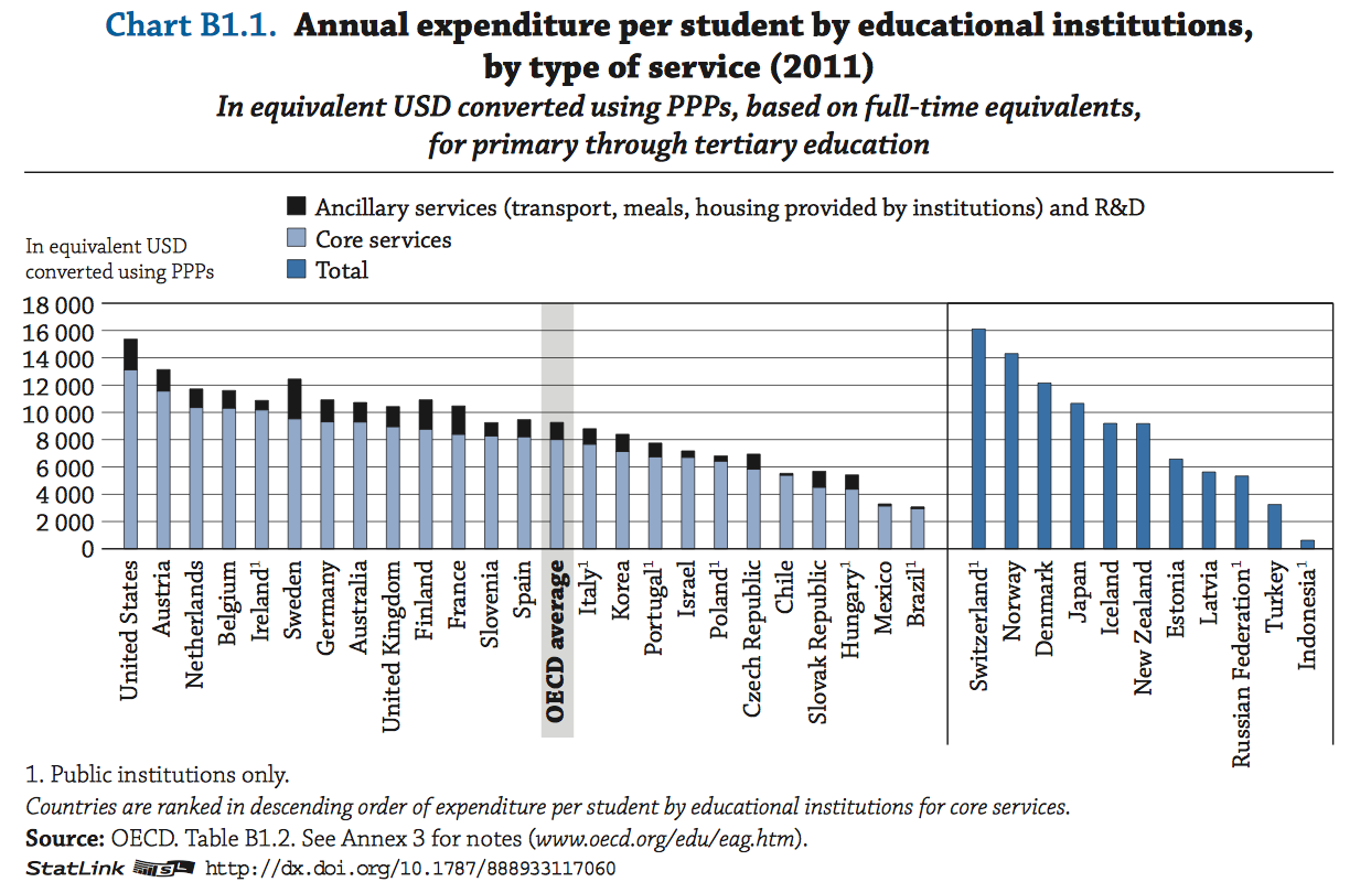
By any measure, Poland has made remarkable education progress since the fall of the Berlin Wall. On the most recent 2012 international tests of 15-year-olds, known as PISA tests, Poland ranked 9th in reading and 14th in math among all 65 countries and sub-regions that took the test. It used to be on par with the United States, a mediocre performer. In math, for example, Poland gained 2.6 points a year between 2003 and 2012 while the rest of the world, on average, remained unchanged.
And on Sept. 9, 2014, when the Organization for Economic Co-operation and Development (OECD) released its annual indicators, “Education at a Glance 2014,” another important indicator appeared: Poland’s college graduation rate is soaring. In 2012, 25 percent of Poland’s adults held a college degree, up from only 11 percent in 2000. At that rate, it could soon eclipse the United States, where more than 40 percent of adults have a college degree (this includes two-year degrees).
“Poland is an interesting case study,” said Andreas Schleicher, director of education at the OECD. “It used to be modest. It is now at the frontier, in little more than a decade.”

This article also appeared here.
How did Poland do it? Its political leaders scrapped their Communist-era education system back in 1998. Instead of the state sorting students into vocational tracks, it opened the system up and allowed students to make their own choices. Dismantling a central command system is not required in most countries, but others countries can learn from Poland, Schleicher says, in two other ways: educational improvements can happen relatively quickly and relatively cheaply.
“For other countries, Poland highlights that what’s really possible in a relatively short period,” Schleicher said. That upends the conventional wisdom in education that real progress is slow and incremental. Also, “None of this has been achieved by putting more money into the system,” he said.
Although spending per student has in fact gone up in Poland (largely because of declining birth rates and a declining student population), the growth in per-student spending remains well below the growth in education spending in other countries. (Click on the chart below, also from the 2014 Education at a Glance publication, to see a larger version).
Fast education results on a modest budget are alluring. And it will take more scrutiny of the Polish education system to understand what teachers are doing there. Classroom culture and student behavior may play a role. Polish teachers spend less time keeping order in their classrooms than teachers in any other nation, according to the OECD’s teacher survey (TALIS 2013).
But instructional time seems to be a key factor. A 2006 World Bank analysis credited initial rise in Poland’s PISA reading test scores, in part, to increased hours of classroom instruction. It noted that back in 2000, Polish students spent fewer than four hours a week reading and writing, but that by 2006, more than three-quarters of Polish students were spending more than four hours a week reading and writing.
Schools in the United States experimented with increased instruction time in the basics during the Bush administration, but have since retreated. Back in the 2000’s, No Child Left Behind policies that mandated student testing prompted a majority of school districts to increase instruction time devoted to the two tested subjects: reading and math. (Source: Center on Education Policy, NCLB Year 5: Choices, Changes, and Challenges: Curriculum and Instruction in the NCLB Era). But parents protested that other subjects, especially science, social studies and the arts, suffered. A majority of states have since received waivers from the testing requirements.
Apparently, parents in Poland did not feel the same way.
The teaching profession is becoming less gray and less green, but more teachers are leaving poor schools
Much ink has been devoted to the teaching profession’s increasingly gray and green complexion — the profusion of teachers at the two extremes of the age spectrum. There are lots of veteran teachers older than 50. Meanwhile, school systems have hired hundreds of thousands of cheaper newbies without much experience in the classroom. That leaves the U.S. school system without as much weight in the happy middle of mid-career, experienced teachers.
But new data from the National Center for Education Statistics,”Teacher Attrition and Mobility: Results From the 2012–13 Teacher Follow-up Survey, First Look,” released Thursday, Sept. 4, 2014, shows that these troubling trends may be abating. In the 2012-13 school year, only 12 percent of the nation’s 3.4 million public school teachers (that includes public charter schools) had less than four years of teaching experience. Compare that with an earlier NCES report that put the percentage of rookie teachers with 1-3 years teaching experience at 17 percent. That’s a 5 percentage point decline in the number of the most inexperienced teachers.
Similarly, there’s good news at the opposite end. Back in 2008-09, a third of the teaching force was 50 years or older. That’s dropped slightly to 31 percent in 2012-13.
What that means, according to Richard Ingersoll, a University of Pennsylvania professor of education who studies teacher turnover, is that the graying of the teaching force is over. “The graying — which was a big story — that is done,” he said. That’s because older teachers have been retiring and are continuing to retire. And there isn’t a huge group of teachers in their forties just behind them.
According to Ingersoll’s analysis, the most common teacher in 1987 had 15 years of teaching experience. But because of two decades of rapid hiring in school districts around the country, by 2008 the most common teacher had only one year of teaching experience. That has again changed because of the decrease in teacher hirings since the recession. “Now that’s not quite true; now the most common teacher is someone in their fifth year,” he said.
Whether rookie teachers will remain a smaller part of the teaching force is unclear. The recent reduction in new hires could be a momentary blip of the 2008 recession, when school systems around the country were scaling back on new hires and laying off teachers (usually those with the least seniority were laid off first). So far, there aren’t any indications that school districts are hiring again. But Ingersoll argues that the two decades of massive hiring until 2008 — with a 48 percent growth in the teaching force compared with only a 19 percent increase in the student population — mean that it will take a much larger decline in the teaching force to rebalance the teacher-student ratio to what it used to be. (The total number of U.S. public and charter school teachers fell only slightly, by 2400 teachers to 3,377,900 in 2012-13.)
The new teacher turnover data also reveal that the charter school sector, often criticized for hiring young teachers who change schools frequently or leave the profession, is becoming more stable. Back in 2008-09, 23.9 percent of charter school teachers either changed schools or left the profession. In 2012-13, only 18.4 percent of charter school teachers had changed schools or left the profession. That’s a 5.5 percentage point decrease in charter school faculty turnover. By contrast, teacher turnover in traditional public schools was virtually flat, at about 15.5 percent, during the same time period.
It’s also unclear whether faculty stability at charter schools is here to stay. It could be that these non-unionized teachers were affected by the recession and didn’t leave their jobs because there weren’t as many job prospects elsewhere. Interestingly, the public school teaching profession is otherwise impervious to economic cycles. Most other professions see a decrease in turnover during recessions because there aren’t as many job prospects elsewhere. But annual teacher turnover has barely budged during the past 15 years over various business cycles, hovering between 15 and 16 percent.
Although the overall picture looks more sunny, with fewer inexperienced rookies and more mid-career teachers in the ranks, one alarming data point emerges. Teacher turnover has grown at schools with high poverty levels. Among schools where more than 75 percent of the students qualified for free or reduced price lunch, many of them in large urban districts, teacher turnover hit 22 percent in 2012-13. In order to get an average number like that, it means that some schools likely saw 40 percent of their teachers leave in one year. In the 2008-2009 school year, by contrast, average teacher turnover in high poverty schools was 15 percent. (See Table 2 in both studies here and here).
Lessons from Hawaii: tracking the right data to fix absenteeism
This article also appeared here.
Good school attendance is associated with all sorts of good educational outcomes, especially higher grades and higher test scores. It’s obvious: if you’re not showing up for school, you’re not going to learn as much. But only 17 states track and report chronic absenteeism data, according to the Data Quality Campaign and Attendance Works, a non-profit organization that advocates for more focus on absenteeism data and ideas for getting students to come to school.
“People aren’t tracking the right data now. They’re paying attention to average daily attendance and truancy, but not the kids who are at academic risk,” said Phyllis Jordan, a spokeswoman for Attendance Works. Truancy is generally defined as unexcused absences, but many chronically absent children don’t get captured in the truancy data because they had a reason for missing school or a parent-signed slip excusing their absence.
A recent presentation by a state education official from Hawaii, one of the 17 states that does track chronic absenteeism, showed just how misleading it is to focus on average daily attendance rates. Dave Moyer, speaking at the 2014 National Center for Education Statistics data conference on July 31, 2014, found that even at Hawaiian public schools where 95 percent of the students show up every day, chronic absenteeism can be a gigantic problem where as many as one in four kids — 25 percent — are missing 15 or more school days a year. Hawaii schools boast of 95 percent daily attendance rates. But when Moyer first drilled down into the data, he found that more than one in five students throughout the state were chronically absent.
It’s worth pausing a moment to understand how these seemingly opposing statistics — high daily attendance and high chronic absenteeism — can coexist. Imagine a school with 100 students and a 95 percent daily attendance rate. On day one, 95 of them show up and five play hooky. Then imagine that the same five students play hooky 15 days in a row. Already, you have 5 percent chronic absenteeism just 15 days into the school year. Now pretend those truant children decide to mend their ways and attend school again. And grab a new group of five kids (from the 95 that had been attending every day) to skip school. Again, you still have a 95 percent attendance rate. But if this second group of 5 skips school for 15 days, then you’d have a total of 10 kids, or 10%, of the student body that would be considered chronically absent. That’s after only 30 days. You could theoretically get to 20% chronic absenteeism just 60 days into the school year.
In other words, it’s a small group of, say, 20 students who are frequently missing school. Maybe only five of them miss school on any particular day. Most of the remaining 80 percent have fairly stellar attendance records. And the school can still boast of a 95 percent attendance rate overall.
Since too few states track it, it’s hard to say if Hawaii’s absenteeism problem is worse than, better than or about the same as the national average. Even the states that track absenteeism have different definitions for what it means to be chronically absent. Hawaii’s threshold of 15 days is believed to be one of the lowest in the nation. Most other states or districts wait until 18 days, or until 10 percent of the 180-day school year is missed, before labeling a student “chronically absent.” A 2012 Johns Hopkins study estimated that 10 to 15 percent of students in the U.S. are chronically absent each year.
Solving absenteeism is another matter. “I don’t know how to fix the problem,” Moyer said. Moyer found that the reasons that kids don’t show up for school are many and varied. Some students suffer from asthma and have trouble coming to school on what Hawaiians call “voggy” days, when volcanic particles are thick in the air. On the big island of Hawaii, a two-mile hike down a steep mountain to the bus stop can be too arduous in bad weather. Bullied kids can be too scared to go to school. Others simply cut school to go to the beach.
Race and ethnicity seem to be a factor, too. Native Hawaiian, Micronesian and Samoan students were disproportionately represented among the chronically absent population.
But Hawaii has had some success in lowering chronic absenteeism statewide from 21.8 percent to 19.7 percent over the last few years, after making principals accountable for it. Five percent of an elementary’s school performance rating is now based on its chronic absenteeism rate. One community noticed that students were hanging out at the Seven-Eleven instead of showing up for school on time, so they persuaded the convenience store to shut down at 7:30 in the morning. “One Seven-Eleven closing had a big effect,” said Moyer. “The best solutions are local.”
So which days of the year are students least likely to cut school? Moyer counted attendance on every day of the school year and found two of the highest attendance rates on Halloween and Valentine’s Day. “Really, the takeaway here is that candy drives attendance,” Moyer jokingly concluded. (Click on Moyer’s chart below to see a larger version).
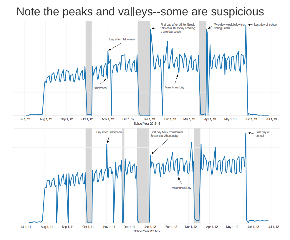
Source: NCES STATS-DC Dave Moyer presentation on Chronic Absenteeism in Hawaii
How much did students really gain on Common Core tests in New York? Data doesn’t say
The main reason for annual standardized tests is to figure out how much kids are learning each year. But when New York released its 2014 Common Core test results on August 14, state education officials were selective in their data reporting and did not disclose actual student scores. Instead they released only the percentage of children hitting various proficiency thresholds. That makes it difficult for outsiders to understand how much New York students improved after their second year of Common Core curriculum and testing.
“Performance levels can be misleading. They can mask the actual score changes that students are making,” said Robert Rothman, senior fellow at the Alliance for Excellent Education in Washington, D.C.
Rothman explained that you can have a big jump in proficiency with only a small test score gain if there are lot of students close to the proficiency cut point. Conversely, if students are far behind, they can have giant test score gains, but not jump over the proficiency threshold. That makes it particularly difficult to see if the most vulnerable students, those in the bottom 10 or 25 percent, are improving.
Despite confusion over how much New York students are improving, New York City’s small gains in proficiency (almost 5 percentage points in math and 1 percentage point in reading) appear to be real progress, experts say, because they mirror similar improvements on national tests (specifically the Trial Urban District Assessment portion of the National Assessment of Educational Progress (NAEP)). On the NAEP, New York City has typically shown a point or two annual gain in math, but flat reading scores. Prior to 2013, when Common Core testing was introduced, New York students had posted much larger gains on the local state tests than on national tests, calling into question how valid test score gains were during the Bloomberg administration.
“No assessment system can tell you the whole story. When you have two different systems, and they’re telling you the same thing, then you have more confidence that the story they’re telling you is correct,” said Henry Braun, the Boisi Professor of education and public policy at Boston College. He concluded that it was a good thing to see small improvement in the second year of Common Core testing, but that it’s going to be a “hard, slow slog” to get the majority of students to the proficient level with only about a third hitting that threshold now.
At the same time, the test-score gap between New York City and the other four largest cities in the state jumps out. New York City has embraced the concept of higher Common Core education standards, and experts think its enthusiasm may be behind the city’s decent showing on the tests. Although the city has outperformed the state’s other cities for years, experts believe that the New York City district is further along than other metropolitan areas in introducing new Common Core lessons into the classroom.
While many political leaders around the country are bowing to public pressure to retreat from Common Core, both Mayor Bill de Blasio and the New York City schools chancellor, Carmen Farina, pointedly confirmed their commitment to Common Core when they announced the test results. “We want to aim high,” said Mayor de Blasio. Both promised to invest more in teacher training to help implement the new standards in the classroom.
This chart below shows how New York City’s students, the majority of whom are low-income minorities, score near the state average with roughly a third of the students scoring proficiently in math and reading. But students in Rochester, Syracuse, Buffalo and Yonkers (where most students are also low-income) are well behind. In Rochester, the weakest performing big city, less than 7 percent of the student population in grades four through eight hit the proficient mark.
Chart created by Jill Barshay using Google Spreadsheets. Data from pages 20 and 32 in the Engage NY August 2014 PowerPoint presentation, Measuring Student Progress in Grades 3-8 English Language Arts and Mathematics.
“The cities in the northern tier are so far below New York City, way, way behind. That ought to be a clarion call to bring to those cities the secret sauce that New York has been using for the past several years,” said Braun.
The city’s Common Core roll out hasn’t been without problems, though. Last school year, teachers throughout the state, including in New York City, complained that curriculum and textbooks were late to arrive and that they had not received enough training in the new standards to teach them effectively.
Getting boys — and girls — interested in computer coding

Mitchel Resnick, LEGO Papert Professor of Learning Research at the Massachusetts Institute of Technology and the head of the Lifelong Kindergarten group at the MIT Media Lab
Thanks to the glorification of Silicon Valley riches and a desire to inspire more of the next generation of children to pursue science and technology careers, computer coding instruction for children is spreading like wildfire around the United States. Code.org , an industry-financed group that is promoting computer coding in schools, says that 31,000 kindergarten through eighth-grade classrooms are using its course, reaching 1.3 million students. It plans to train another 10,000 teachers to teach computer coding this school year.
But experts involved in computer coding education lament that it remains a boy-dominated activity. Mitchel Resnick, an MIT professor, developed Scratch, a simplified computer programming language that allows children to create and share interactive stories, games and animations, and says that Scratch use has tripled over the past year. Scratch is aimed at eight- to 16-year-old children, but both younger kids and older adults use it, too. But boys significantly outnumber girls, 59 percent to 35 percent. (About 6 percent didn’t disclose their gender). Code.org says that 40 percent of its students are girls. And both organizations believe they’ve attracted a higher percentage of girls than the typical after-school computer programming club or elective class does.
Resnick has found, however, that girls are particularly active in commenting on projects posted by users of his site. “At one point, we looked at the top 10 people,” he said, referring to the 10 people who had commented most frequently. “Eight of them were girls or young women,” he said.
Overall, girls account for 44 percent of the 1.2 million comments posted about computer programming projects on Scratch every month. Girls outnumber boys more than two to one in comments within Scratch’s studio area, where kids experiment with role-playing and story-telling games.
This article also appeared here.
One hypothesis is that when you make computer coding more social, it engages girls more. And perhaps that will be a way to attract more girls to computer science. Resnick believes that girls will continue to be attracted to computer coding if they see it as a natural extension of their interests, be they art or drama, and that the programmable video animation is a way of expressing their creativity, instead of being seen as an exercise in mathematical logic.
Scratch is one of many children’s programming languages, including Microsoft’s Kodu and Gamestar Mechanic, which are rapidly gaining in popularity. Most of the kids using Scratch design animated videos or computer games; Resnick calls these creations “projects,” instead of “computer programs,” and says users are posting about 10,000 projects every day. After more than a decade of being largely ignored by school age children, “coding has entered the popular culture,” he said. Here is a link to Scratch usage statistics. For more background on the resurgence of computer programing, see this May 2014 New York Times piece.
Resnick also developed a new free iPad app, ScratchJr, aimed at five to seven year olds. Released to the public on July 30, 2014, the app allows children to snap together graphical blocks to make characters move, jump, dance and sing. Separately, Resnick is working on producing a tablet version of Scratch, which is currently only available on a laptop or desktop computer.
Reflections on the underemployment of college graduates
Most people — and especially parents of 20-something college graduates — know that the job market is particularly tough right now for recent college grads. But so tough that about half of them are either unemployed or underemployed?
This article also appeared here.
That is what analysts for the New York Federal Reserve Bank of New York calculated, in a January, 2014, report, “Are Recent College Graduates Finding Good Jobs?” Defining “underemployed as working in low-paid jobs that don’t require college degrees, the analysts, Jaison R. Abel, Richard Deitz, and Yaqin Su, found that roughly 6 percent of recent college graduates, aged 22 to 27, were unemployed at the beginning of 2013 and 44 percent were underemployed. The unemployment figure has likely dropped since then, along with the overall drop in unemployment. But it’s quite possible that underemployment — the percentage of college grads who are in jobs that don’t require college degrees — hasn’t changed much.
Curiously enough, this New York Fed study was largely a rebuttal to the popular notion that the job market is much worse for college grads today. The authors looked at two decades of data and found that the combination of unemployment and underemployment is roughly the same today as it was for college graduates in the early 1990s who also had to seek jobs during a recession. By age 30, the majority of the 1990s cohort eventually found better work, and the same could happen for the current crop of college graduates.
But the authors also pointed to some ominous signs. They drilled down into the data of the underemployed and noted that it’s more likely for recent graduates to be in a low-wage or a part-time job than in the past. In other words, there’s a smaller share of college graduates in well-paying non-college jobs, such as electrician, dental hygenist or mechanic. And there’s a rising share of college graduates in the lowest paid of the non-college jobs, such as bartender, food server and cashier. That could make it harder for these young adults to transition to higher skilled jobs in the next few years. Time will tell.
I emailed with Harvard professor Richard B. Freeman, one of the leading U.S. labor economists, about this. He believes things are also worse now for American college graduates because of international competition. “The college graduate situation has a global dimension — 6 million bachelor’s graduates in China that affect the U.S. market as well — which is very different than in the past,” he wrote.
It’s worth pausing a moment to understand how economists think about underemployment, an admittedly fuzzy term. The New York Federal Reserve used the Department of Labor’s O*Net surveys. If at least 50 percent of the respondents working in a particular occupation say it requires a college degree, then the New York Fed labeled the occupation a college job. And it called a college graduate “underemployed” if he or she worked in a job for which less than half the respondents said a bachelor’s degree was necessary. Under this definition, every college-educated real estate broker, registered nurse and Shakespearean actor is classified as underemployed.
Sometimes fields change and become more sophisticated. Twenty years ago, some jobs didn’t require college degrees that now do. My own profession — journalism — is one where many people didn’t have a college degree a couple generations ago. Now, even O*Net says reporters need a college degree. One question interesting labor economists is whether the employers hiring young adults can be more selective than the job itself warrants, and can demand college degrees simply because they have an excess of college graduates to choose from. Many elementary schools in the New York City area, for example, have the luxury of being able to demand that any teacher’s aide have a B.A. But O*Net says that the degree isn’t necessary for that job. Over time, that could change, if enough teacher’s aides respond that a college degree is necessary to be a teacher’s aide, even though you could perform the job superbly without one.
“In recent years, we have increased credential requirements for jobs that haven’t changed that much,” said Richard Vedder, director of the Center for College Affordability and Productivity and an economics professor emeritus at Ohio University.
Vedder’s own analysis of underemployment in January 2013 preceded the NY Fed’s research, but came up with similar findings — that 48 percent of college graduates are underemployed. In “Why Are Recent College Graduates Underemployed?” by Vedder, Christopher Denhart and Jonathan Robe, the authors used the Bureau of Labor Statistics’ “Education and training assignments by detailed occupation, 2012” to determine which jobs would make a college-educated person “underemployed.”
Seeing big numbers like that can make one’s college-educated eyeballs pop. But the New York Fed points out that a third of all college graduates — not just recent ones — have always been categorized as underemployed. Think of all the college-educated real estate brokers, ad salesmen, nurses. Not so tragic. Some earn very good livings.
A new data set, released on July 8, 2014, from the Department of Education, also helps flesh out the picture of employment prospects for recent graduates. The data, from the Baccalaureate and Beyond surveys, looked at the employment of 2008 college graduates four years later, in 2012. It found that 7 percent were unemployed and 8 percent had dropped out of the labor force and weren’t looking for work. About 16 percent were in grad school, some of them working part-time, some not. Of the remaining 69 percent who were working and not in grad school, 15 percent were in one or multiple part-time jobs. I think we can all agree, any college graduate in a part-time job is underemployed.
Related stories:
College-for-all vs. career education? Moving beyond a false debate
Federal education data show male-female wage gap among young college graduates remains high
Even with free tuition, hurdles remain for raising number of college graduates
US educators lead the world in overestimating student poverty, which may affect educational mobility
AndreSource: Andreas Schleicher OECD
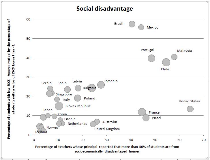
Do educators’ perceptions of how disadvantaged their students are matter? Put another way, when teachers think their students are underprivileged, do they have lower expectations for them, and do their students achieve less at school?
In a July 22, 2014, article “Poverty and the perception of poverty – how both matter for schooling outcomes,” Andreas Schleicher, director of education and skills at the Organization for Economic Cooperation and Development (OECD), argues that perceptions often matter more than reality, with distressing consequences. He found that principals in some countries vastly overestimate the poverty level of their students, and their perception of disadvantage negatively correlates with student math achievement. That is, the greater the misperception of poverty, the more likely it is for 15-year-old students’ math scores to be predicted by their actual socio-economic status, and the harder it is for disadvantaged students at the bottom of the socio-economic ladder to score among the top students.
“In countries like France and the United States, perceived disadvantage is far greater than real disadvantage, and it makes a significant difference for student performance,” Schleicher wrote in the article.
Conversely, he found that educators in many top-performing nations greatly underestimate how disadvantaged their students are. Yet the truly disadvantaged students in these nations are more likely to score in the top tier on the PISA math test.
Schleicher’s data analysis mashed together three different data sets: international math test results, teacher surveys and socio-economic indicators. (Footnote: The math test was the OECD’s Program for International Assessment (PISA) given to 15-year-olds around the world. The survey data was from the OECD’s Teaching and Learning International Survey (TALIS) question 15c. Socio-economic indicators came from the OECD’s own index of economic, social and cultural status (ESCS) that is generated with the PISA test results.)
In the United States, for example, 65 percent of teachers work in middle schools where the principals surveyed said that more than 30 percent of their students come from socieconomically disadvantaged homes, the highest perception-of-poverty rate among the 30 countries analyzed by Schleicher. In reality, only 13 percent of American 15-year-olds come from disadvantaged homes, by OECD calculations. (Footnote: The OECD socio-economic index factors in not only income, but also parental education, educational resources at home and other family possessions. Because the United States is a relatively rich country, many among the 21 percent of school-age children living below the national poverty line are not counted in the low-income bracket by OECD standards, hence the OECD’s seemingly low figure of 13 percent.)
At the same time, Schleicher calculates that only 20 percent of disadvantaged students in the United States are able to score in the top quartile on the PISA math test. In France, it’s about the same. In Israel, another country for which there is a large gulf between perception and reality, only 10 percent of disadvantaged students score among the top in math.
By contrast, the percentage of actually disadvantaged children in Japan and Korea (about 10 percent) is similar to the percentage in the United States — but only 6 percent of Japanese principals and 9 percent of Korean principals report believing that 30 percent of their students are disadvantaged. Six times as many U.S. principals believe the poverty rate is that high. In Croatia, Serbia and Singapore, more than 20 percent of students are actually disadvantaged — much higher than in the United States — yet not more than 7 percent of principals say they have significant populations of disadvantaged students.
(Andreas Schleicher’s bubble chart, reproduced at the top of this story, depicts perception on the horizontal axis and actual disadvantage on the vertical axis. The larger the circle, the more educational inequality there is in that country, i.e., the more a student’s socio-economic status determines his math achievement. Click on the chart to see a larger version).
This article also appeared here.
In Singapore more than half the students from the bottom quarter of the socio-economic spectrum score in the top quarter of the world’s students on PISA. In Japan, 45 percent of disadvantaged students perform better on the PISA test than their backgrounds would predict. That’s remarkable educational mobility: roughly half of the most disadvantaged students in the bottom 25 percent in these countries score in at the top 25 percent.
This is fascinating. I asked Scheicher how much this analysis hinges upon where you set the poverty level. If the OECD were to set the bar higher, closer to where the U.S. sets its own poverty line, there would not be such a giant gulf between perception and reality. And we could not blame US educators for overestimating poverty so enormously.
Schleicher admits that poverty is a relative measure, which each country defines differently. If the OECD used a higher bar, every nation’s poverty rate would simply be much higher. But American educators would still have the highest perceptions of student poverty. His conclusions about educational opportunity — or lack thereof — for the bottom quartile would still be true.
“Obviously, a child considered poor in the United States may be regarded as relatively wealthy in another country,” he wrote, “but the fact that the perceived problem of socio-economic disadvantage among students is so much greater in the United States – and in France too – than the actual backgrounds of students also suggests that what school principals in some countries consider to be social disadvantage would not be considered such in others.”
The main concern I have about the correlation between perceived poverty and educational opportunity is that U. S. students post mediocre performances on the PISA math test in general. Yes, low-income students don’t do well on PISA test, but most wealthy students don’t, either. And I suspect that U.S. teachers don’t harbor lower expectations for rich Americans!
Related stories:
What makes for happier teachers, according to international survey
PISA math score debate among education experts centers on poverty and teaching
Top US students lag far behind top students around the world in 2012 PISA test results
The number of high-poverty schools increases by about 60 percent
Right and wrong methods for teaching first graders who struggle with math
 To help young kids who struggle with math, well-intentioned teachers often turn to non-traditional teaching methods. They use music and movement to involve the whole body. They use hands-on materials such as popsicle sticks to help the students understand tens and hundreds. Or they encourage students to come up with different strategies for solving 7 + 8. One complicated way could be starting with 10 + 10 and then taking 3 away (because 7 is 3 less than 10) and then taking 2 away (because 8 is 2 less than the other 10). After many steps, the right answer emerges. And the students came up with it themselves. Good teaching, right?
Wrong.
A new study concludes that those first-graders who are behind their peers would have learned more if their teachers had just taught them to add and subtract the old-fashioned way. And then practiced it a lot.
The study, Which Instructional Practices Most Help First-Grade Students With and Without Mathematics Difficulties?, was published June 26, 2014 in Educational Evaluation and Policy Analysis, a peer-reviewed journal of the American Educational Research Association.
Average and above-average students learn about as much with either the innovative or traditional approaches. It doesn’t much matter. But any random classroom is likely to have some strugglers in it; for them, the researcher conclude, traditional, teacher-directed instruction generally yields better results.
The researchers, led by Paul L. Morgan at Pennsylvania State University, analyzed U.S. Department of Education data from about 14,000 students across the United States who entered kindergarten in 1998. They first looked at how the students performed on math tests in kindergarten. The data included teacher surveys, allowing the researchers to track the methods that the kids’ subsequent first-grade teachers said they used. And finally, they had the students’ first-grade math scores.
The researchers found that the higher the number of struggling students, who scored in the bottom 15 percent in kindergarten, in a first-grade teacher’s classroom, the more likely the teachers were to use manipulatives (hands-on materials), calculators, music and movement (See Table 3 on page 12 in the study). The fewer the struggling students, the more likely that teachers stuck with traditional methods, such as showing the whole class how to solve something one way from the chalkboard and then having students practice the method using worksheets.
Yet, at the end of first grade, the researchers found that struggling students who were given traditional instruction posted significantly higher math score gains than the struggling students who had been taught by the progressive methods. Gains are measured by how much students math scores rose between kindergarten and the end of first grade. (See Table 5 on page 15 in the study.)
“Routine practice is the strongest educational practice that teachers can use in their classroom to promote achievement gains,” Morgan said.
This article also appeared here.
Although many educators dismiss rote learning as both boring and bad, Morgan believes it has its place. “Given my interest in children at risk, it’s a troubling observation that teachers are mismatching their instruction to what children with learning difficulties might benefit from,” Morgan said. “These kids with low math achievement in kindergarten are likely to struggle throughout elementary school and beyond. These kids are really at risk.”
Understanding why the more innovative methods didn’t work spectacularly is a matter of conjecture. Morgan theorizes that, just as children need to practice reading a lot and become fluent readers before they can analyze texts, math students need to become fluent with basic operations before they can talk about multiple methods for solving problems or arrive at deep conceptual understandings. “Maybe children with learning difficulties need more practice,” he said.
Innovative methods can also be more challenging to implement properly, and it could be that many teachers aren’t doing them right. It’s not easy to facilitate a math discussion. Six-year-olds are prone to goof around and stick popsicle sticks in their ears, taking away from precious teaching time. Instructional time can be lost while a teacher is setting up a musical lesson.
Does this mean we should all be drilling our first graders with Kumon worksheets? Morgan says not. “I don’t want kids going to school and doing worksheets all day. We all want kids to view mathematics as something that’s interesting and engaging and useful,” he said. “At the same time, we don’t want to be providing instruction to kids that doesn’t have empirical evidence that it’s effective.”
Then what’s a teacher to do? I’ll leave it to others to figure out how to make routine methods engaging.
Federal education data show male-female wage gap among young college graduates remains high
Conventional wisdom has it that young men and women tend to earn similar wages as young adults, but that the male-female gap widens a lot with age, especially as women “lean out” during their child-bearing years. The Pew Research Center, for example, calculated that young adult women (ages 25-34) earned 93 cents for each dollar that her male counterpart earned in 2012. Near parity.
This article also appeared here.
But the latest data from the U.S. Department of Education, which surveyed a nationally representative sample of 17,110 students who graduated in the 2007-2008 academic year, found that college-graduate women aren’t making anywhere near as much as their male counterparts are four years after college graduation.
The men who were in full time jobs made $57,800 on average. The women in full time jobs made $47,400 on average. In other words, these women, most of them unmarried and without children, were earning only 82 cents for each dollar that a man was in 2012.
The data, from the Baccalaureate and Beyond surveys, comes from the third group of college graduates that the United States Department of Education is tracking to see what happens in labor markets after college. This third group was first surveyed a year after graduation, in 2009. A second survey followed up four years after graduation, in 2012, and some of the data, largely focusing on post-college employment and wages, were released on July 8, 2014.
Women’s lower earnings defy easy explanation.
Part of the answer is that women and men tend to major in different subjects and go into different fields. Women are far more likely to pursue degrees in education and nursing, two fields which tend to be dominated by unionized jobs with low starting salaries. Higher salaries that come with seniority generally kick in after four years. Meanwhile, men are more likely to major in engineering, which is the major that produced the highest paying post-college jobs. College graduates who majored in engineering and were working full time earned $73,700 a year on average. Healthcare majors made $58,900 and education majors made $40,500.
Majors of 2008 Graduates by Gender (percent of each gender majoring in that subject)
| Women | Men | |
| 1 | Business (20%) | Business (28%) |
| 2 | Social sciences (17%) | Other Applied (14%) |
| 3 | Other Applied (16%) | Social Sciences (13%) |
| 4 | Humanities (12%) | Engineering (12%) |
| 5 | Education (12%) | Humanities (11%) |
| 6 | Healthcare fields (11%) | Bio and phys science, sci tech, math and agriculture (9%) |
| 7 | Bio and phys science, sci tech, math and agriculture (7%) | Computer and IT (5%) |
| 8 | General studies and other (3%) | Education (4%) |
| 9 | Engineering (2%) | General studies and other (3%) |
| 10 | Computer and IT (1%) | Healthcare fields (2%) |
Source: Computed using National Center for Education Statistics QuickStats and data from 2008/12 Baccalaureate and Beyond Longitudinal Study (B&B:08/12)
But that is only part of the story. When you break the salary data down by major and gender (using the Department of Education’s Quickstat data analysis tool), you see giant wage discrepancies among men and women who majored in the same subjects. The chart I created on this page shows that young male engineers make more than young female engineers ($73,000 vs. $65,000)*. Young male computer programers make more than young female computer programers ($71,000 vs. $60,000). There’s even a big gender gap for social sciences majors ($51,000 vs. $40,000) and general studies majors ($64,000 vs. $44,000). However, the pay gap virtually disappears in education ($41,000 vs. $39,000) and health care ($59,000 vs. $56,000).
Using the Powerstats data analysis tool, I dug into the data more to look at the interplay of race and gender. And there are some startling results. Asian women were earning almost $53,000 a year — more than either black or Latino men and not far behind white men. Black men earned $52,000. Latino men earned $47,000. The top earners were Asian men at $63,000, followed by white men at $57,000. White, black and Latino women are closely clustered together, making $45,000, $43,000 and $44,000, respectively.
I was curious if child rearing was having an effect on this data. For an apples-to-apples comparison, I created a second Powerstats chart to isolate only childless men and women. Some were married. Some were not. The wage levels and differentials described above remained. Even childless women earn far less than childless men. Asians earn more than other races. Black men fare better than Latino men.
It is possible that some of these salary gaps are the quirks of a four-year check up after college. Many of the graduates who will be the highest earners over the course of their lifetimes are in graduate school, earning their JD’s, MD’s and MBA’s. As full-time students, they’re excluded from the full-time employment data. And that means the data is a bit skewed by the people who go into high-paying fields that don’t require graduate degrees, such as engineering and computer science. Perhaps, once all the female lawyers and doctors join the workforce a few years from now, the gender pay gap will narrow some.
Data notes: I filtered the data to capture only students who are working more than 34 hours a week in one primary job. It does not include students who were in graduate school in 2012. All the salary figures are rounded to the nearest thousand. The numbers generated through the statistical tools do not add up exactly to the numbers in the published 2008/12 Baccalaureate and Beyond report. For example, the breakdown of male salaries by major show that men of all 10 majors had an average full time salary of almost $56,000. The report says that male salaries were almost $58,000. That may be due to some differences in weighting.
* This and subsequent salary data rounded to the nearest thousand dollars
