Universities with 10 largest endowments raise tuition for low income students more than for high income students

This article also appeared here.
This week of March 10, 2014, I was playing around with a new data tool, Tuition Tracker, produced by Holly Hacker of the Dallas Morning News and my Hechinger Report colleague Jon Marcus. The tool allows anyone to see the actual tuition charged to students of different income groups at every college and university in the United States. It lays bare how college tuition sticker prices are like hotel room rates or used car prices. Not many students pay them. The Tuition Tracker uses the four years of available data from the federal Integrated Postsecondary Education Data System (IPEDS) produced by the National Center of Education Statistics. The authors’ big takeaway was that universities are actually lowering tuition for high income students and raising it for low income students.
I wanted to see what was going on at the 10 richest, mostly highly endowed universities . So I created this chart by combining data from the Tuition Tracker with NACUBO’s endowment data.
Tuition increases by family income at the 10 most highly endowed U.S. Universities (2008-11)
| Top Endowments | University (endowment) | 2008-09 Net Price for families below $30k* | 2011-12 Net Price for families below $30k | 2008-09 Net Price for financial-aid families above $110k | 2011-12 Net Price for financial-aid families above $110k | low income tuition change | high income tuition change |
| 1 | Harvard ($30 billion) | 423 | 2880 | 32145 | 34980 | 581% | 9% |
| 2 | Yale ($19 billion) | 5187 | 7852 | 28564 | 36442 | 51% | 28% |
| 3 | University of Texas ($18 billion) | 8184 | 8967 | 20965 | 23594 | 10% | 13% |
| 4 | Stanford ($17 billion) | 3120 | 4501 | 37286 | 37357 | 44% | 0% |
| 5 | Princeton ($17 billion) | 3110 | 8322 | 24608 | 34153 | 168% | 39% |
| 6 | MIT ($10 billion) | 3400 | 4995 | 37187 | 38469 | 47% | 3% |
| 7 | University of Michigan ($8 billion) | 6144 | 5431 | 20071 | 23098 | -12% | 15% |
| 8 | Columbia ($8 billion) | 4870 | 12081 | 39860 | 36551 | 148% | -8% |
| 9 | Texas A&M ($8 billion) | 4902 | 5089 | 18773 | 19146 | 4% | 2% |
| 10 | Northwestern ($7 billion) | 12823 | 15633 | 40237 | 41986 | 22% | 4% |
* Harvard data was missing for 2008-09. I used 2009-10 instead. For University of Texas, only Austin campus tuition figures were used. For Texas A&M, only College Station campus tuition figures were used. For University of Michigan, only Ann Arbor tuition figures were used.
Source: Tuition Tracker for tuition data and NACUBO for endowment data.
What I found is that, yes, these highly endowed universities are also hiking tuition bills for the poorest students whose families make less than $30,000. While they’re not lowering tuition for upper income students (except for Columbia University!), the tuition increases for wealthier students have been lower, on average, than for the poor students. I’ve highlighted in red the universities that are hiking tuition bills for low income students more than for high income students.
A few caveats and explanations of the data:
1) This federal IPEDs data is tracking only freshmen students who qualify for federal grants, loans and work study programs. There are many high-income students at these universities who are not included in the high-income tuition price*. A good way of reading the chart is to say, “In 2009 Harvard charged a net-price tuition of $32,145 to freshman students from families who made over $100,000 and who qualified for some sort of federal aid.” This net price is the sticker price minus Harvard’s own financial aid and discounts. It also subtracts grants and scholarships from federal, state and local governments. It does not factor in loans or work-study aid.
Even if we expanded beyond this subgroup of high income students to the entire high income population at these schools, I believe the conclusion still holds true that low income students have suffered higher tuition hikes than high income students. Since the sticker price tuition at Harvard did not increase by 581% during these years, low income students still experienced more tuition inflation than high income students.
2) High income families. Many families making more than $110,000 live in expensive cities. It can be a real struggle to send multiple children to college especially if they are on the low end of those six figures.
3) Low income families. Not all families making under $30,000 are as low income as you might think. Many are divorced and the federal government only looks at the income of the custodial parent. The other parent could be a highly paid banker. The financial aid office of many universities requires that the non-custodial parent submit income information and factors that into the net tuition price charged.
Related stories:
College, federal financial aid increasingly benefits the rich
Correction: The definition of of net sticker price was corrected in this blog post. An earlier version incorrectly said that “(Net sticker price) does not factor in the federal financial aid these students are receiving.” The net price is the sticker price minus grants and scholarships from the institution, as well as grants from federal, state or local governments. So it includes federal gift aid, but not loans or work study.
*Addendum: After I posted, Holly Hacker, the creator of the Tuition Tracker, emailed me that you can get some sense of how large of a share of students we’re capturing through this IPEDS data by looking at this separate NCES data. About 70 percent of dependent undergrads with incomes below $40,000 received federal financial aid in 2007-08, compared with 33 percent of those with incomes above $100,000. Too bad it’s not broken down by college. But safe to say that the high-income tuition figures we’re using apply to fewer than half the high-income students at Harvard.
US rookie teachers relatively better paid than veteran teachers
I had some critical feedback over my March 7, 2014 post about US teachers being the 6th highest paid in the world, according to a UNESCO analysis. One reader questioned the absurdity of a chart that says US teachers make $105 a day when their average annual salary is $54,704. I could imagine many intelligent members of my family asking the very same question so I wanted to step back and explain these purchasing power parity income figures better.
If you were to multiply $105 x 365 days per year, you would get an annual salary of $38,325. That would be equivalent to a pre-tax annual salary of $54,704 with an effective tax rate of 30% (that’s federal, state and local taxes combined). That sounds about right to me.
If you simply compared this $105 against teacher wages in other countries, you’d end up thinking that the countries with the strongest currencies had the highest paid teachers. For example, the Swiss franc is very strong now. $100 US Dollars buys you only 88 CHF (Swiss Francs). It wouldn’t be fair to say the average Swiss teacher salary of 75,000 CHF* translates to more than $85,000 or 57% more than a US teacher’s salary of $54,000. That’s because a bus ride will run you almost $4 and a one bedroom apartment in the city center will cost $1600/month. It’s a lot more expensive to live in Switzerland if you’re paying in dollars. What you want to know is what is a teacher’s standard of living? Can they afford to buy rib eye steaks and a car?
So economists have figured out a purchasing parity index to compare wages across countries. They start with a basket of goods (food, shelter, transportation, clothes, utilities, etc.) and calculate how much each currency can buy of these things. In the example above, you would calculate how much of that American basket of goods a Swiss teacher can buy on his or her salary. According to UNESCO, Swiss teachers are pretty well off. On their salaries Swiss teachers can buy 24% percent more stuff than American teachers can, on average. Not 57% more.
My critic also pointed to this fantastic OECD chart showing where teachers salaries rank within their own countries.
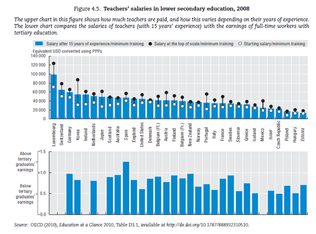 It shows that in most other countries, teachers earn less than other college graduates. (Spain is the only country where teachers make more than the average college graduate.) But in the US, the differential is huge. American teachers earn a lot less than other college graduates. Italy and Israel have similar salary gaps.
I wonder if this gap has something to do with the inequality of income distribution in the United States. The high end of the income distribution (I’m thinking CEOs, fund managers and orthopedic surgeons) creates an unusually high average salary in the US. Unless we start taking away stock options or imposing higher taxes on high income Americans, we not going to get rid of that. Even if we paid teachers $100k a year.
I also wanted to point out that in the top blue chart, US teachers have the 12th highest salaries in the world, not the 6th highest. It shows that many countries with top ranking students on the PISA test are paying their teachers more. But note the fine print. This blue chart is a ranking of veteran teachers’ salaries after 15 years of experience. The chart I originally showed averaged the salaries of all teachers, including rookies.
When you drill down deeper into the blue chart, you’ll notice that the starting, minimum salaries for American teachers are relatively high. But your salary doesn’t grow much over time. Whereas in Korea, rookie salaries are quite low, but veteran teachers are paid handsomely.
Maybe what matters is paying excellent teachers a lot to stay in the profession.
* It varies by canton. This is a rough approximation.
Related story:
U.S. teachers 6th highest paid in the world
U.S. teachers 6th highest paid in the world
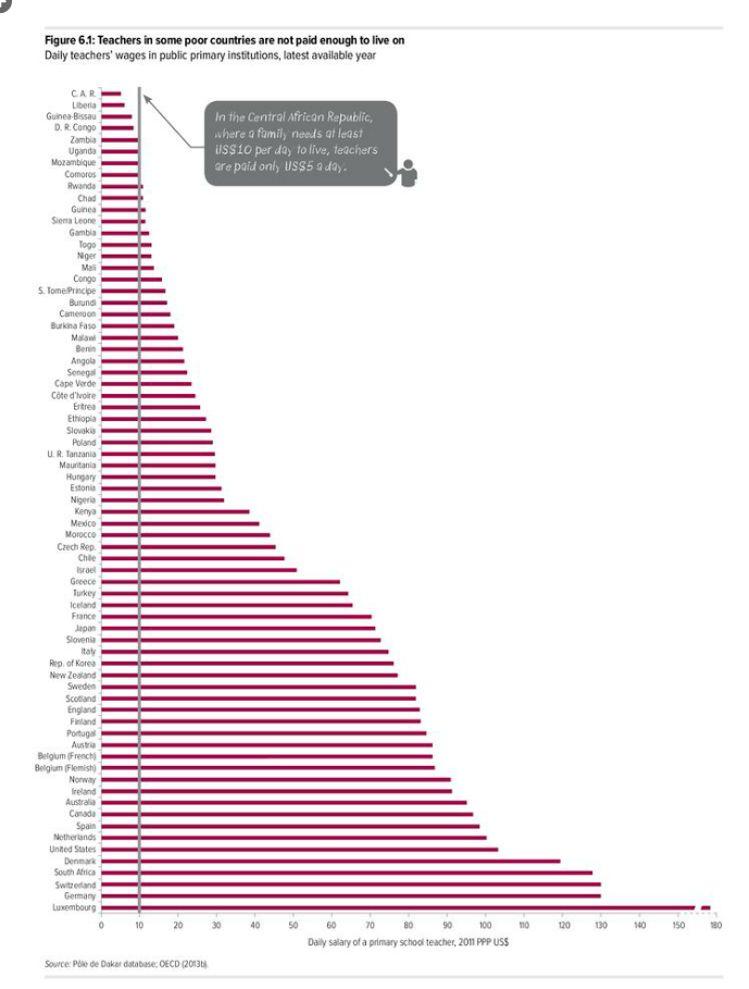 I tend to think of US teachers being relatively poorly compensated in our society, especially when compared to say, private equity fund managers. And I always thought that many developed nations paid their teachers far more than we do in the United States. So I was surprised to see that U.S. public school teachers are the sixth highest paid teachers in the world, according this January 29, 2014 UNESCO analysis (p. 254) that adjusts wages by domestic purchasing power so you can compare different currencies and countries more fairly. (Click on the chart to see a larger version where you can read the country names and $$ more easily).
The other interesting thing is that Asian countries, whose students top the international charts on PISA tests, don’t rank highly on this teacher salary chart. The highest paid teachers in Asia are in South Korea, the 21st county on the list.
Follow up post:
US rookie teachers relatively better paid than veteran teachers
Women graduates more likely to get a job straight out of college than men
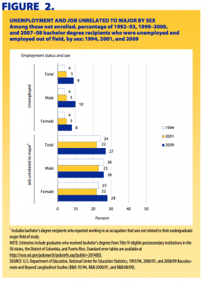 One year after graduating from college, in 2009, about 8 percent of female graduates who earned their degrees in 2007–08 were unemployed. Compare that to male college graduates during the same time period. Ten percent of them were unemployed. That’s according to the National Center for Education Statistic’s brief, New College Graduates at Work: Employment Among 1992–93, 1999–2000, and 2007–08 Bachelor’s Degree Recipients 1 Year After Graduation, released on March 6, 2014.
Both are depressing unemployment rates, but keep in mind we were in the middle of a recession.
I remember, when I was covering the 2008 recession at my old radio show Marketplace, that men were disproportionately hit in the layoffs. That was because men were more likely to be working in construction or factories, two sectors that were hit hard. But these were, for the most part, men without college degrees. At first glance, I find it puzzling that employers would prefer to hire a female college graduate over a male one. Perhaps women have a leg up when it comes to entry level positions these days? Any thoughts?
One answer is deeper in the data. Twenty eight percent of women were working in a job unrelated to their major, whereas only 26 percent of men had made that decision to get a job outside of their field. Female graduates seem more willing to compromise and take a less-than-ideal job that comes their way.
Almost a third of college drop outs would have been more likely to graduate had they started at a two-year college

This article also appeared here.
One of the knocks on community colleges is that many students who might have succeeded in completing a four-year college degree are unable to weather the college transfer process. They get their associate’s degree, but not their bachelor’s. Indeed, back in 2009, Bridget Terry Long and Michal Kurlaender found hard evidence that starting at a two-year college lowers the probability of bachelor’s degree attainment. (Students who initially began at community colleges were 14.5% less likely to complete bachelor’s degrees within 9 years.)
But a January 2014 Calder working paper by Erin Dunlop Velez of the American Institutes of Research puts an interesting twist on this conventional wisdom. Dunlop Velez crunched a data sample representing all students in the United States who were between 12 and 16 years old in the beginning of 1997, with the majority of the college going sample entering college between 1999 and 2003.
Her first findings confirmed what Long and Kurlaender noticed. “About 70% of four- year college drop-outs have a higher predicted probability of success beginning at a four-year college,” she wrote.
BUT
“But for the other 30% of the sample, their predicted probability of bachelor’s degree attainment would have been higher had they started at a two-year college. This is particularly true for first-generation college students, about 40% of which would have been more likely to earn a bachelor’s degree had they begun at a two-year college.”
This poses a conundrum for education policy. You’ve got one giant chunk of students that’s better off starting at a four year college. But another sizable minority that would have been better off with different advice.
Dunlop Velez makes an effort to describe this group that would have been better off starting at a 2-year-college. They tend to be minorities and first-generation college students.
The downside of steering a student to the wrong path may not be terrible. In many cases community college grads outlearn those with a bachelor’s.
White students predicted to be in the minority in U.S. public schools by fall 2014

This article also appeared here.
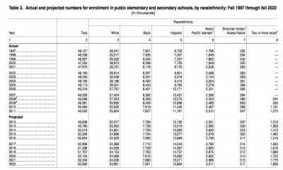
The National Center for Education Statistics released its “Projections of Education Statistics to 2022” with data on enrollment, teachers, graduates, and expenditures. Page 33, Table 3 shows how white students are projected to switch from majority to minority status this fall 2014. Click on the table below to see a larger version.
I also found it interesting that the high school graduation population is projected to decrease. (The number of high school graduates increased by 27 percent between 1997-98 and 2009-10, and a decrease of 2 percent is projected by 2022-23.) Will that mean it’ll start to get easier to get our kids into college?
High tech collaborations between traditional schools and after-school or museum programs
In the first installment of the Smithsonian Center for Learning and Digital Access’s new online discussion series, “Digital Directions in Learning”, academic researchers highlighted the Young Writers Project, as an example of an innovative high-tech community that allows students to write, revise and share their writing with students at other schools. It began as an after-school program in Vermont, but is now used nation-wide in classrooms.
Prof. Mark Warschauer, Associate Dean of the School of Education at University of California, Irvine and director of the Digital Learning Lab there, pointed out that the Young Writers Project has created an online community for creative expression. It differs sharply from other high tech educational programs in which students passively complete an online version of a worksheet.
Richard Culatta, Director of the Office of Educational Technology at the U.S. Department of Education, praised the Chicago Summer of Learning, where students can earn online badges for real-world experiences. But Kylie A. Peppler, Assistant Professor at the Learning Sciences Program of Indiana University, Bloomington, cautioned that students should not just be counting up their badges, but also building portfolios where they can show their work.
The academic researchers were particularly interested in how to stimulate a child’s passion for learning, particularly in scientific and mathematical fields. They felt that museums and after-school programs are important places to give children an opportunity to do a “deep dive” into a subject and develop a passion that could later be pursed in high school or college. “You get the interest activated in an out-of-school setting … then build upon that in a school setting,” said Kevin Crowley, Professor of Learning Sciences and Policy, School of Education and Learning Research & Development Center and Director, University of Pittsburgh Center for Learning in Out-Of-School Environments (UPCLOSE), University of Pittsburgh.
Crowley argues that it’s very important to spark these passion before middle school, after which school takes up too much of a young person’s time. Crowley says in his interviews with scientists, “more than 85% of scientists were passionate (about the subject) before middle school.” He says that it’s never too early to start and that there are ways that parents can even talk to a one year old at a museum that helps a child find his interests. Early fascinations with dinosaurs and trips to the natural history museum, for example, can end up leading to an interest in science.
Warschauer argued that young people need more access to subject experts. Ideally, parents should think about expanding their child’s network to adult scientists. He thought technology — even simple Skype interviews — could play a greater role in exposing children to real world experts.
Top 10 teachers in Florida illustrate how messy and absurd the new teacher data is
This week of February 24, 2014 the State of Florida was forced to dump a boat load of data on its teachers into the public domain (It lost a law suit to Times Union newspaper in Florida, which requested the data). Nearly every public and charter school teacher in the state is named. And next to each named teacher is a “value added measure,” a figure that’s supposed to represent how effective he is based on how much his students’ reading and math test scores surpassed what you would expect them to be.
It starts with a complicated formula that predicts how much you expect each student to learn during the year. I’m not quite clear on how the formula factors in where a student started. It’s usually easier to show larger gains off of a low starting point. But much harder to show gains from a high starting bar. I’ve already seen at least one post from a teacher of “gifted” students, complaining that she now has a negative value added measure because her students started the year with very high test scores. Her students’ scores increased at the end of the year, but not by as much as the complicated formula predicted they should have. It’s possible that this teacher isn’t very good. But it’s also possible that she’s a great teacher. It would be fascinating to calculate how many of the teachers of advanced students received negative value added scores.
One illustration of how bad this data is is simply to look at the top 10 list of teachers in the State. (I sorted the entire database by value added measure and made this table).
| Teacher Name | School Name |
|
Value Added Measure | Taught a course measured by the state tests | ||
| 1 | RHODEN,TARA ARLENE | BAKER COUNTY MIDDLE SCHOOL | BAKER | 326.69% |
|
|
| 2 | FISCHETTI,TRACY JANE | NAVARRE HIGH SCHOOL | SANTA ROSA | 273.99% | Yes | |
| 3 | MUNOZ,JULIA | LATIN BUILDERS ASSOCIATION CONSTRUCTION AND BUSINESS MANAGEMENT ACADEMY | DADE | 265.23% |
|
|
| 4 | HARRIS,SAMANTHA LEIGH | LATIN BUILDERS ASSOCIATION CONSTRUCTION AND BUSINESS MANAGEMENT ACADEMY | DADE | 265.23% | No | |
| 5 | YORDAN,LINETTE MARIE | RONALD W. REAGAN/DORAL SENIOR HIGH SCHOOL | DADE | 259.38% |
|
|
| 6 | BURRIER,LYNNE M | FORT MYERS HIGH SCHOOL | LEE | 251.89% |
|
|
| 7 | PHELAN,STACEY MARIE | CORAL REEF SENIOR HIGH SCHOOL | DADE | 249.34% | No | |
| 8 | FERNANDEZ,HILARIO LAZARO | BEN SHEPPARD ELEMENTARY SCHOOL | DADE | 243.21% |
|
|
| 9 | KEARNEY,KAREN E | F. W. BUCHHOLZ HIGH SCHOOL | ALACHUA | 241.88% |
|
|
| 10 | BUTLER,LORINE GRIER | ENGLEWOOD HIGH SCHOOL | DUVAL | 234.52% | No |
It’s not immediately apparent what subjects each of these teachers teach but 8 of the top 10 don’t even teach the courses that are measured by the state’s math and reading tests that were used to calculate the value added measures. They could have been art or physical education teachers. For the teachers that don’t teach a subject measured on the test, the state still uses the students verbal and math test scores. It’s just that other teachers taught those subjects to these students.
I happened to Google a few of the teachers on the list above. It turns out Lynne Burrier-McDill is a math teacher. But when you look up the details behind her stellar value added measure, only her students reading scores were used. Go figure.
More students don’t always mean lower test scores
When masses more students began taking the SAT in the 1980s and 1990s, average scores dropped so much that the SAT makers had to recalibrate the scoring system in 1995. To make sure the national average still approached 500 in each verbal and math section, each student got a bump of about 50 points (a combined bump of 100 points).
A similar expansion of test takers is happening with the Advanced Placement (AP) in exam. I was curious to see if a larger, more diverse population is leading to a dramatic lowering of AP scores. The short answer is yes, it is. But it’s not as dramatic as I would have expected from the SAT experience.
I looked at the State of Maryland, which has the highest AP participation in the country. More than 47 percent of high school graduates in Maryland take at least one AP exam. The College Board released this report on the state on February 11, 2014 as a supplement to its annual report.
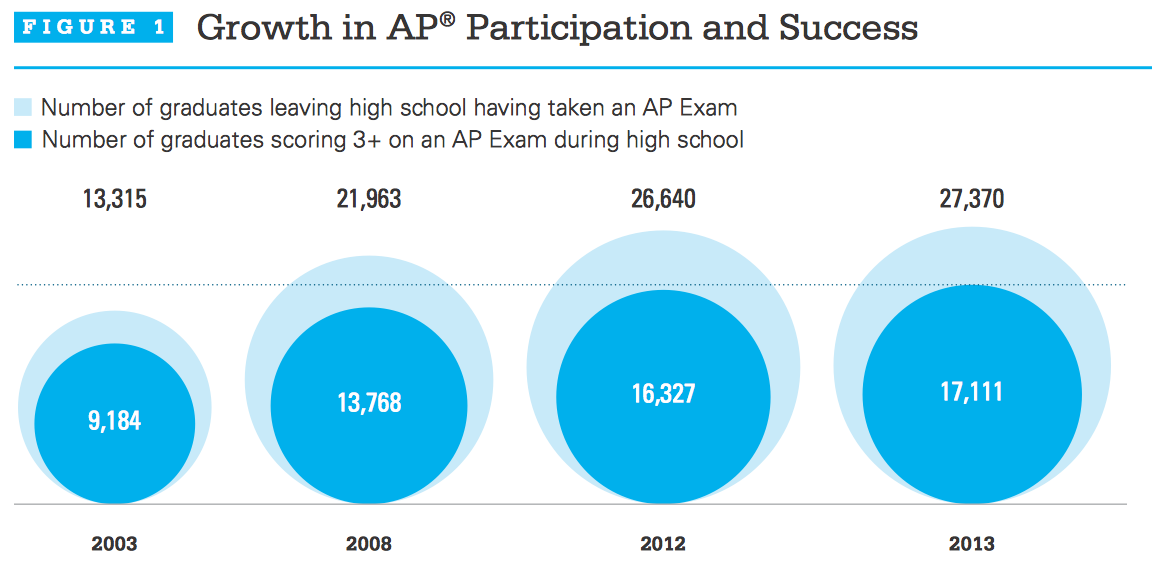
Here’s a graphic from the Maryland College Board report.
Back in 2003, roughly 13,000 high school grads took an AP exam and 69 percent of them got at least a 3. (I’ll use a 3 as a proxy for a passing score although many colleges require 4’s and 5’s for the test to count for college credit). In 2013, over 27,000 high school grads took an AP exam and only 63 percent of them got at least a 3. It’s quite remarkable that the rate of attaining at 3 or higher went down by only 6 percentage points even though participation more than doubled. I’d be curious to see how the rate of attaining a 5 changed, but I don’t immediately see that data.
10 most (and least) popular Advanced Placement (AP) subjects
Ambitious college-bound U.S. high school students continue to have a deep aversion to math and science, according to my reading of the latest Advanced Placement (AP) test data released by the College Board on February 11, 2014. In this table I compiled of the top 10 subjects, only Calculus AB (the easier of the two math tests) makes it into the top five. Physics and computer science aren’t in the running.
10 Most Popular AP Exams for the Class of 2013
|
AP Subject |
Total Number of Exams Taken by the Class of 2013 During High School |
3+ (“qualified” in subject) |
5 (top score) |
|
|
1 |
English Language and Composition |
390,754 |
57.6% |
9.8% |
|
2 |
United States History |
366,641 |
52.1% |
10.5% |
|
3 |
English Literature and Composition |
325,108 |
55% |
6.8% |
|
4 |
Calculus AB |
223,444 |
57.7% |
22.6% |
|
5 |
United States Government and Politics |
216,944 |
50.5% |
11.1% |
|
6 |
Psychology |
199,222 |
66% |
20.3% |
|
7 |
World History |
175,065 |
47.2% |
8.3% |
|
8 |
Biology |
162,381 |
55.6% |
12.7% |
|
9 |
Statistics |
141,335 |
56.9% |
12% |
|
10 |
Chemistry |
107,431 |
54.5% |
15.7% |
It’s relatively hard to get a 5 in these popular subjects, except for calculus and psychology, in which more than a fifth of the test takers do. I wonder if that’s because these English and history exams are harder? Or is it that a broader range of students is attempting these “softer” subjects?
For the fun of it, I made a table of the least popular AP subjects and, not surprisingly, foreign languages dominate. I was surprised that only one science class (Physics) was among them. What really pops out, however, are the crazy high scores for Chinese. More than 70% of the test takers are getting 5’s. Wowza! Generally, the scores are higher for these less popular exams.
10 Least Popular AP Exams for the Class of 2013
|
AP Subject |
Total Number of Exams Taken by the Class of 2013 During High School |
3+ (“qualified” in subject) |
5 (top score) |
|
|
1 |
Japanese Language and Culture |
1,477 |
71.9% |
38.2% |
|
2 |
Italian Language and Culture |
1,495 |
68% |
13.6% |
|
3 |
Studio Art: 3-D Design |
3,261 |
65.7% |
10.1% |
|
4 |
Latin |
3,545 |
58.5% |
12.9% |
|
5 |
German Language and Culture |
4,152 |
74.1% |
18.9% |
|
6 |
Chinese Language and Culture |
5,684 |
94.6% |
70.1% |
|
7 |
Studio Art: Drawing |
13,098 |
77.5% |
14.8% |
|
8 |
Physics C: Electricity and Magnetism |
14,045 |
67.4% |
27.9% |
|
9 |
French Language and Culture |
14,121 |
73.3% |
14.2% |
|
10 |
Spanish Literature and Culture |
15,249 |
68% |
8.9% |
I drilled a bit deeper into the College Board’s report on the Chinese language subject test and learned that 90.8% of the test takers are “Asian, Asian-American or Pacific Islander.” Presumably, many of these students speak some Mandarin at home. For students who end up going to colleges that grant credits for high AP scores, that’s a clever way to reduce college costs. The College Board has a searchable database on what every college and university’s AP credit policy is. I was surprised to see that even Harvard will let you save tuition if you get a 5 on at least four AP tests. (Check the fine print. Harvard docks some AP tests by half.)
Overall, the College Board is very successful in getting more students to take AP exams. Despite criticism of the curriculum, there seems to be no slow down to the proliferation of AP courses. Total AP exams taken have more than doubled in the past decade to 3.2 million by the high school class of 2013. The high school class of 2003 took a total of 1.3 million exams. Even in the past year, the number of exams has increased 10 percent from 2.9 million exams taken by the high school class of 2012.

