Washington DC and Tennessee post huge gains in math and reading in 2013 while nation shows small improvement
Fourth and eighth grade public school students in Washington DC and Tennessee showed huge gains on national math and reading tests in 2013 from two years ago, the last time the National Assessment of Education Progress (NAEP) exams were administered. Unusual seven point gains were seen on some tests, whose results were released on Nov. 7, 2013. By contrast, the nation’s public schools on average were flat or posted small one or two point gains in the same time period.
Still, Washington DC’s test scores remain the worst in the nation. It ranks dead last behind every state in the Union in 4th grade and 8th grade math and reading tests. Similarly, Tennessee is among the bottom half of the states, below the national average.
The National Center for Education Statistics (NCES) did not comment on what might have caused these outsized gains in Washington DC and Tennessee. I plan to look into how demographic changes and gentrification in the nation’s capital might be correlated.
National results
In assessing the national results, NCES Commissioner Jack Buckley said that that the small, incremental gains in math and reading “suggest that students are making progress.” Over time, small one and two point gains can add up to meaningful improvement. But he cautioned that not all students are making even these small, incremental gains. When you drill down to the nation’s bottom and top students by percentiles, you see that the bottom half of students aren’t making progress and that most of the gains are among our higher performing students. You can also see this inequality trend on a regional basis. For example, Massachusetts is still one of the top scoring states in the nation, but it showed a small decline in fourth grade reading. When you drill down into which students were scoring worse, it was the poor students who qualify for free or reduced price lunches. There was no slippage in scores among middle class or affluent children.
The way I would phrase it at a cocktail party would be like this: The richer are getting smarter. The poor are stagnating. Yet another sign of how growing income inequality in our country is affecting outcomes.
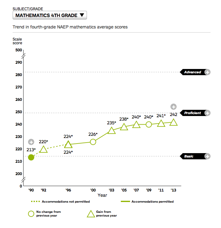
Historical Perspective. When you look back at how the nation’s scores have changed over the years (see chart), you see giant gains in math since 1990, especially for fourth graders. But scores seem to have stagnated since 2007. That’s because our bottom students used to be especially weak and educational policies in the 1990s specifically focused on raising the achievement level of our bottom students. But now that the national distribution of test scores is more normal, resembling a conventional bell curve, it is unlikely that we will see the kinds of huge gains we saw in the 1990s and early 2000s again, according to Commissioner Buckley.
Additional NAEP Coverage from Education Week .
Federal “datapalooza” and college ratings to come next year
Inside Higher Ed reported Oct. 31, 2013 that the White House and Department of Education will be hosting a “datapalooza” in the Spring of 2014 that will “look at better ways to package and provide access to existing federal data on colleges and students, such as the government’s Integrated Postsecondary Education Data System, known as IPEDS.”
The same article says that the Department of Education is targeting 2014-15 to launch a new college ratings system. It will measures student outcomes such as earnings and graduation rates. The new nominee for Under Secretary of Education, Ted Mitchell, is expected to play a big role in the new ratings system. He is the former president of Occidental College and the current president of New Schools Venture Fund.
Data Debate: Smartest U.S. states don’t hold a candle to global competitors
On Oct. 24, 2013, Julia Ryan wrote in The Atlantic that American Education isn’t Mediocre — It’s Deeply Unequal, after digesting new test score data that rank U.S. states among other nations. “Students in Massachusetts are doing great compared to their international peers, according to the National Center for Educational Statistics. Students in Alabama, Mississippi, and D.C., however, are languishing.”
I would argue that Massachusetts should be embarrassed and that inequities are old news.
We’ve known for a long time that Washington D.C., Alabama and Mississippi lag behind the nation in test scores. Every year, a national test, called the National Assessment of Educational Progress or NAEP, is administered and the U.S. Department of Education releases a ranking of the states based on the scores. I just hopped onto the NCES site and generated a state-by-state ranking for eighth graders on the most recent 2011 math test.
Average Mathematics scale score sorted by all students (overall results), grade 8 public schools: By average scale score, 2011
| Order | State | Score |
| 1 | Massachusetts | 299 |
| 2 | Minnesota | 295 |
| 3 | New Jersey | 294 |
| 4 | Vermont | 294 |
| 5 | Montana | 293 |
| 6 | New Hampshire | 292 |
| 7 | North Dakota | 292 |
| 8 | Colorado | 292 |
| 9 | South Dakota | 291 |
| 10 | Texas | 290 |
| 11 | Kansas | 290 |
| 12 | Virginia | 289 |
| 13 | Maine | 289 |
| 14 | Wisconsin | 289 |
| 15 | Ohio | 289 |
| 16 | Washington | 288 |
| 17 | Maryland | 288 |
| 18 | DoDEA | 288 |
| 19 | Wyoming | 288 |
| 20 | Connecticut | 287 |
| 21 | Idaho | 287 |
| 22 | North Carolina | 286 |
| 23 | Pennsylvania | 286 |
| 24 | Indiana | 285 |
| 25 | Iowa | 285 |
| 26 | Utah | 283 |
| 27 | Alaska | 283 |
| 28 | Illinois | 283 |
| 29 | Nebraska | 283 |
| 30 | Rhode Island | 283 |
| 31 | Delaware | 283 |
| ? | National public | 283 |
| 32 | Oregon | 283 |
| 33 | Missouri | 282 |
| 34 | Kentucky | 282 |
| 35 | South Carolina | 281 |
| 36 | New York | 280 |
| 37 | Michigan | 280 |
| 38 | Oklahoma | 279 |
| 39 | Arkansas | 279 |
| 40 | Arizona | 279 |
| 41 | Georgia | 278 |
| 42 | Nevada | 278 |
| 43 | Florida | 278 |
| 44 | Hawaii | 278 |
| 45 | New Mexico | 274 |
| 46 | Tennessee | 274 |
| 47 | West Virginia | 273 |
| 48 | Louisiana | 273 |
| 49 | California | 273 |
| 50 | Mississippi | 269 |
| 51 | Alabama | 269 |
| 52 | District of Columbia | 260 |
(This report was generated using the NAEP State Comparisons Tool.http://nces.ed.gov/nationsreportcard/statecomparisons/)
We didn’t need fancy statisticians to rank U.S. states internationally to tell us that our high income states are doing a lot better than our low income states.
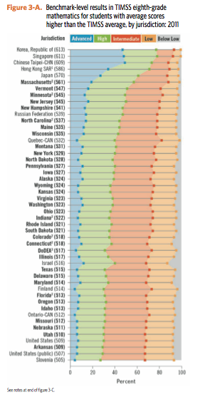
The new news is the international rankings and that our “smartest” states don’t hold a candle to our global competitors. The problem is Massachusetts, which lags behind Chinese Taipei, Hong Kong, the Republic of Korea, Singapore and Japan in math. Massachusetts is our fourth wealthiest state as measured by per capita income or median family income. More than 80% of the state’s residents are non-Latino white or Asian. When we see the United States slipping in international rankings, #12 in math in 2011 on the TIMSS test, I used to think in my head, well, probably Massachusetts measures up. The Atlantic touted that Massachusetts outranked 42 education systems. But the majority of those are developing countries which includes Iran, Chile, Ghana and Kazakhstan. Most of Europe doesn’t take part in the TIMSS test anymore. And big countries like China and India never took the test. My hunch is that Massachusetts would be way below #6 if we had a more complete international ranking.
I talked with Bill Schmidt, a professor at Michigan State University and an expert in international test scores. He worried that some states would take mistaken pride in their international rankings. “A certain state will claim that it’s ranked 5th, 6th or 7th in the world. That’s an absolutely silly comparison. It’s as if you looked at only the schools along the Champs Elysees in France and compared that with the whole United States,” Schmidt said.
Schmidt says that you have to try to find regions with similar levels of poverty or social class and compare them across countries. That’s hard to do.
Another international test, known as PISA, will be released in early December. Many more European countries take part in that one and it will be interesting to see where top U.S. students rank there.
Prior coverage:
Unclear where U.S. students stand in math and science
No connection between income and public pre-K in New York State
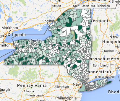 A new graphic shows how uneven public pre-K is throughout the state of New York. The school districts shaded in dark green are where more than 75% of the 4 year olds attend a universal pre-K program funded by the state. In the Clifton-Fine school district, only 25% of the children are poor, but 100% of their 4 year olds are served in the public schools. The state spends $4123 on each of them. Montauk is another interesting example. Only 12% of its student population qualifies as poor, but all of its 4 year olds are in public pre-K, costing the state $912 each. But in New York City, where 34% of the children are in poverty, only 59% of the kids are in public pre-K. The state spends $3895 on each of them. More than 230 school districts have opted not to participate in public pre-K.
Two reports were issued Oct 24, 2013 on the cost of extending public pre-K to all students.
The Challenge of Making Universal Prekindergarten a Reality in New York State by the Citizen’s Budget Commission.
Making Prekindergarten Truly Universal in New York by The Campaign for Educational Equity and the Center for Children’s Initiatives
Unclear where U.S. students stand in math and science
I don’t know what to make of a long-awaited report issued Oct. 24, 2013 by the National Center of Education Statistics showing that most U.S. eighth grade students are not at the bottom of the global barrel when it comes to math and science. The study extrapolates what students in every state in the Union would have scored on an international test, the TIMSS, had they taken it, based on what they actually scored on the NAEP.
On the plus side, 36 states scored above the international average in math and 47 states scored higher than the international average in science.
On the negative side, students in even our strongest state, Massachusetts, trail behind students in Chinese Taipei, Hong Kong, the Republic of Korea, Singapore and Japan in math. This is important. I often hear people dismiss the American sliding in international statistics because they correctly point out that the U.S. has greater poverty than these other countries. Naturally, average scores will be lower in countries that have higher rates of poverty. But, when you have a high income state like Massachusetts that can’t keep up with the Joneses, I fear there’s something wrong with the U.S. education system. Our problem is at the top.
The other thing that has me troubled about this data report is that too many countries are not in the study: India, China, France, Germany…..the list goes on. I fear that our ranking would be even lower if they were included.
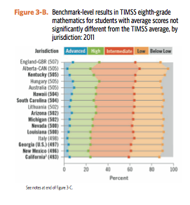
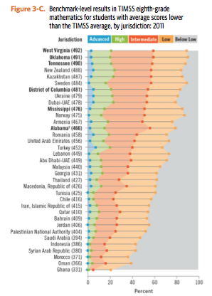
Here’s the full report. And chained below are three graphics from the report (on pages 14 and 15) that show where each state, from Massachusetts to Alabama, ranks. The first graphic ranks our top performing states, the second graphic our middling states and the third graphic our bottom states. If you chain all three graphics together, you’d have a full list.
A data-driven argument to reduce testing in schools
The U.S. is off to a bad start when it comes to using data to improve schools, concludes a National Education Policy Center October 2013 report entitled Data Driven Improvement and Accountability by Andy Hargreaves and Henry Braun of Boston College. The authors urge U.S. policy makers to reduce the amount of testing in schools and to measure student growth during the year rather than arbitrary proficiency thresholds at year’s end.
“One of the objections to increasing the level of sophistication of tests and indicators is the increased cost. But it is counterproductive to control costs by settling for lower test quality that impedes improvement, diminishes authentic accountability, and undermines the system’s credibility. A widely used and successful alternative is to reduce the scope and frequency of testing. This can be achieved by testing at just a few grade levels (as in England, Canada and Singapore), rather than at almost every grade level. Another option is to test a statistically representative sample of students for monitoring purposes (as in Finland), rather than a census of all students. Yet another route is to test different subjects in a rotating cycle (e.g. math is centrally tested and scored once every 3 or 4 years), with moderated teacher scoring of assessments occurring during the intervening years (as in Israel). All these options lower the costs of testing and create opportunities for compensatory improvements in quality. At the same time, not testing all students, every year, reduces the perverse incentives to teach to the test and to concentrate disproportionately on easily “passable” students.”
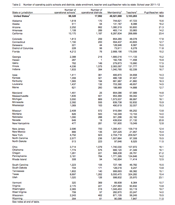
California student-teacher ratio highest in the country
The number of public school students for every full-time teacher in California was 23.4 during the 2011-12 academic year, almost 50 percent above the national average of 16 students per teacher. The lowest student-teacher ratio was in Vermont with 10.7 students per teacher.
The National Center for Education Statistics released in October 2013 a preliminary report on all the public schools in the country during the 2011-12 school year. Table 2 which looks at student-teacher ratios in every state caught my eye. It’s calculated by counting up all the students and dividing by all the full-time teachers (or full-time equivalent) teachers. (See Table 2 at the bottom of this post).
My first instinct is that these numbers are misleading. You might well have 30 students in a classroom, as many public schools do in New York City, and yet New York States can still post an overall ratio of 12.9. That’s because there may be lots of specialist teachers, from speech therapists to music teachers, that aren’t a daily presence in the classroom but still count toward lowering the ratio.
I’ve heard from researchers that the United States is obsessed with class sizes and puts a lot of resources into throwing more teachers into schools to lower these ratios, whereas other countries might hire fewer but more qualified teachers. For example, the typical classroom in Japan has more than 30 students. See this OECD explainer on class sizes around the world.
Recently, Malcom Gladwell got into the debate, arguing in his new book that small classes are actually harmful. This New Statesman piece called that “pseudo” science.
Background Reading on Class Sizes
Examining the effect of class size on classroom engagement and teacherepupil interaction: Differences in relation to pupil prior attainment and primary vs. secondary schools by Peter Blatchford, Paul Bassett, Penelope Brown
Class Size: What Research Says and What it Means for State Policy by Matthew M. Chingos and Grover J. “Russ” Whitehurst
Analysis of teacher surveys points to a high-tech pitfall — one size fits all
Sometimes a bunch of data analysis leads to a non-numerical, but important thought. If teachers rarely get to decide what to purchase for their classrooms, be it the desks or the textbooks, then administrators might end up choosing educational software based on which vendors offer the best prices or cover the most subjects. And the buyers probably won’t have enough expertise in, say, algebra vs. chemistry vs. 4th grade reading, to know which software works well in each case.
“This top-level decision-making will only allow for so much attention to detail in terms of which technologies are best for which subject areas,” wrote Briana Pressey in a new report by the Joan Ganz Cooney Center at Sesame Workshop released in the fall of 2013.
The report analyzes five surveys that asked teachers across the nation what they think about using technology in the classroom. The five surveys were released between 2012 and 2013. Unfortunately, there are no clear answers. Some teachers like technology, some don’t. Some want more proof that it works.
Pressey says that future surveys would be more useful if they separated teacher responses by subject area, since a math teacher might have a different perspective than a reading teacher. And that would actually help district administrators make purchasing decisions.
The survey designers may be falling into the same pitfall that district administrators fall into. Asking all teachers basic questions about technology might be as silly as buying all your educational software from one vendor. Let’s get granular.
Momentum growing to protect student data
Who owns a schoolchild’s data? Everything from where they live to their test scores? Schools collect it and the federal government explicitly allow schools to share this data with outside contractors, such as a data storage company or an educational software vendor, without getting parental permission first. But it’s unclear what schools and outside vendors can do with this data. Surely many would be outraged if student data were used to market products to students the way that online advertisers do on Facebook.
The New York Times reported yesterday that a children’s advocacy group is calling for major education software vendors to set limits on what the private sector can do with student data and come up with some national standards. The group, Common Sense Media, is better known for its ratings of children’s videos and games. But its plea is getting some quick traction. The State Educational Technology Directors Association, an influential trade association, sent out an email, saying that it supports Common Sense Media’s call for action. “This is a big deal,” wrote Doug Levin, SEDTA’s executive director. “Industry needs to understand the rules of the road in handling data about students and a way to distinguish good actors from bad.”
The threat to industry is that Washington will set the standards for them. The New York Times piece quoted Sen. Ed Markey, D-Mass., saying that the government should issue new regulations “It’s clear to me that parents, not schools, have the right to control their children’s information, even if it’s in the hands of private companies,” Mr. Markey said in a phone interview on Friday. “I am going to ask the Department of Education to lay out specific guidelines to protect students from having their records compromised.”
I’m curious how Republicans will react to this one. Will they oppose new regulations on businesses? Or will they hew to the Tea Party line of protecting individual privacy?
Bonus pay for teachers thoroughly discredited
Debate closed: paying teachers extra for student performance does not work. The research community’s conviction that giving teachers bonus pay for high student test scores does not work was solidified in the fall of 2013 when the U.S. Department of Education’s Institute of Education Sciences added a RAND report to its What Works Clearinghouse and commented that the research met its high standards “without reservations”. The report, A Big Apple for Educators, found that under its current design, New York City’s pay-for-performance program did not improve student achievement or teachers’ reported attitudes, perceptions, or behaviors. A separate RAND study, the nation’s first randomized experiment to test teacher incentive pay, also found that students of the teachers who were eligible to earn bonuses did not outperform the students whose teachers were not eligible for bonuses. The NYC report also received the American Educational Research Association’s 2012 Outstanding Policy Report (Short Report) award.
Can we extrapolate that the same would be true for students? Is it equally ineffective to pay your child for good grades? Curious what the data say.
It’s also interesting to think about this “market failure,” as economists would call it, and understand why so many market-based solutions fail in education.

