I had some critical feedback over my March 7, 2014 post about US teachers being the 6th highest paid in the world, according to a UNESCO analysis. One reader questioned the absurdity of a chart that says US teachers make $105 a day when their average annual salary is $54,704. I could imagine many intelligent members of my family asking the very same question so I wanted to step back and explain these purchasing power parity income figures better.
If you were to multiply $105 x 365 days per year, you would get an annual salary of $38,325. That would be equivalent to a pre-tax annual salary of $54,704 with an effective tax rate of 30% (that’s federal, state and local taxes combined). That sounds about right to me.
If you simply compared this $105 against teacher wages in other countries, you’d end up thinking that the countries with the strongest currencies had the highest paid teachers. For example, the Swiss franc is very strong now. $100 US Dollars buys you only 88 CHF (Swiss Francs). It wouldn’t be fair to say the average Swiss teacher salary of 75,000 CHF* translates to more than $85,000 or 57% more than a US teacher’s salary of $54,000. That’s because a bus ride will run you almost $4 and a one bedroom apartment in the city center will cost $1600/month. It’s a lot more expensive to live in Switzerland if you’re paying in dollars. What you want to know is what is a teacher’s standard of living? Can they afford to buy rib eye steaks and a car?
So economists have figured out a purchasing parity index to compare wages across countries. They start with a basket of goods (food, shelter, transportation, clothes, utilities, etc.) and calculate how much each currency can buy of these things. In the example above, you would calculate how much of that American basket of goods a Swiss teacher can buy on his or her salary. According to UNESCO, Swiss teachers are pretty well off. On their salaries Swiss teachers can buy 24% percent more stuff than American teachers can, on average. Not 57% more.
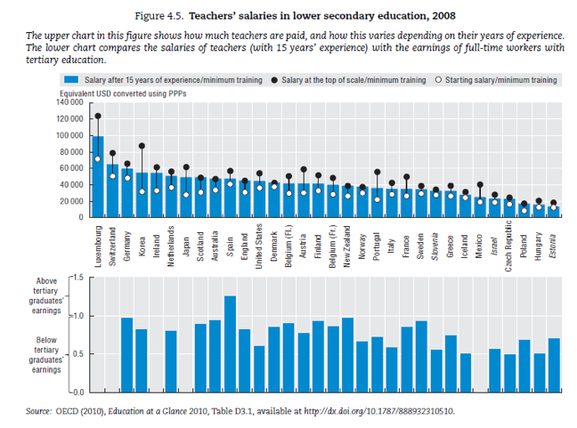
My critic also pointed to this fantastic OECD chart showing where teachers salaries rank within their own countries.
 It shows that in most other countries, teachers earn less than other college graduates. (Spain is the only country where teachers make more than the average college graduate.) But in the US, the differential is huge. American teachers earn a lot less than other college graduates. Italy and Israel have similar salary gaps.
I wonder if this gap has something to do with the inequality of income distribution in the United States. The high end of the income distribution (I’m thinking CEOs, fund managers and orthopedic surgeons) creates an unusually high average salary in the US. Unless we start taking away stock options or imposing higher taxes on high income Americans, we not going to get rid of that. Even if we paid teachers $100k a year.
I also wanted to point out that in the top blue chart, US teachers have the 12th highest salaries in the world, not the 6th highest. It shows that many countries with top ranking students on the PISA test are paying their teachers more. But note the fine print. This blue chart is a ranking of veteran teachers’ salaries after 15 years of experience. The chart I originally showed averaged the salaries of all teachers, including rookies.
When you drill down deeper into the blue chart, you’ll notice that the starting, minimum salaries for American teachers are relatively high. But your salary doesn’t grow much over time. Whereas in Korea, rookie salaries are quite low, but veteran teachers are paid handsomely.
Maybe what matters is paying excellent teachers a lot to stay in the profession.
* It varies by canton. This is a rough approximation.
Related story:
U.S. teachers 6th highest paid in the world


